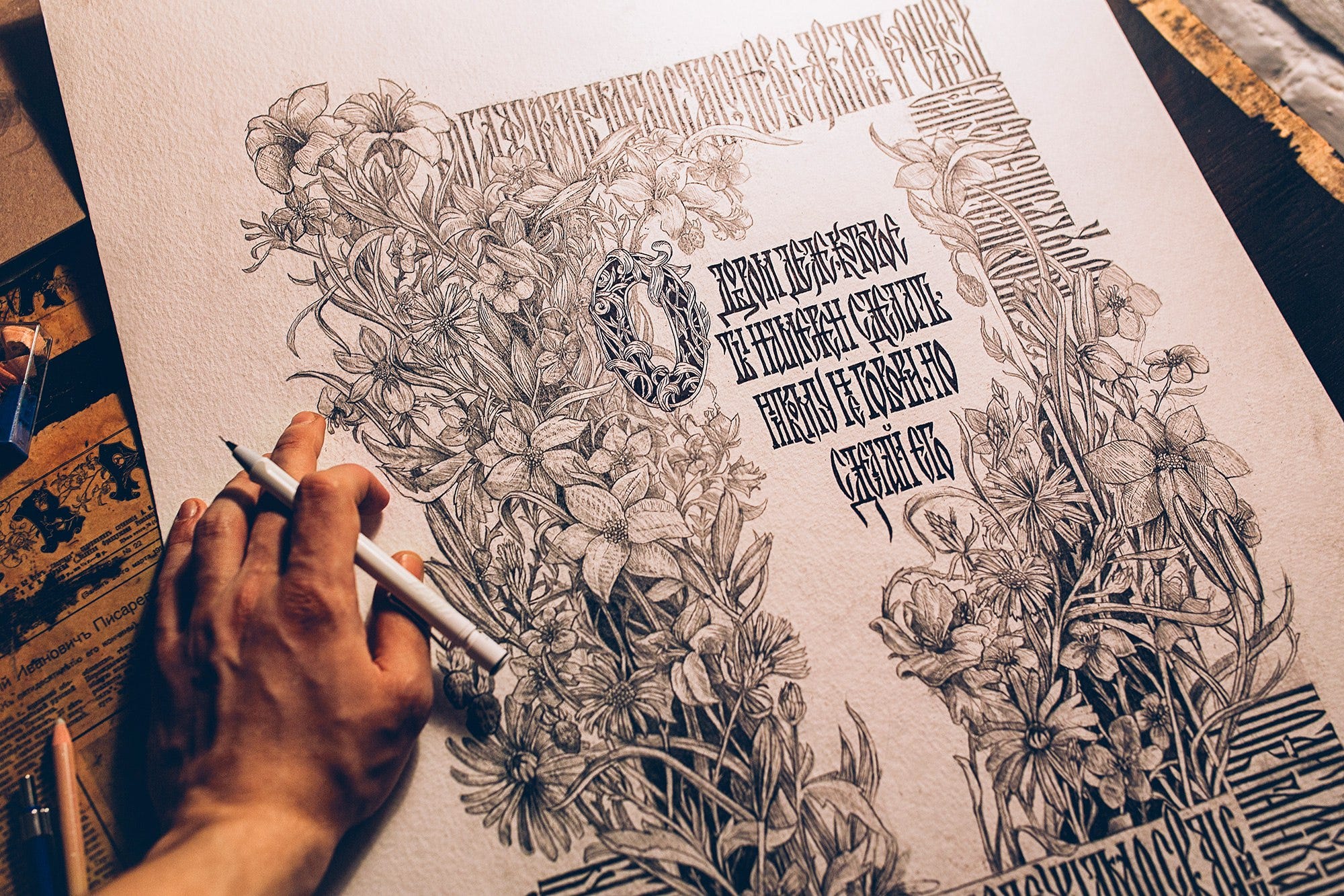
High Style Vyaz

If you have read and understood my previous articles, this one will be easy to understand.
By saying “High Style Vyaz,” I mean my personal art style, which I developed during my creative work. However, it would be incorrect to consider it solely my own since it is a product of collective thinking and activity. The development of visual culture can’t be maintained by one person alone (still, there are rare cases), and I am greatly indebted to the work of Andrey Martynov and many other authors.

“High Style Vyaz” is a display, monospaced font set with a medium stroke contrast, medium weight, and serifs. The letter forms have no single “calligraphic predecessor” — they are based on both broad and sharp instruments and wholly new and invented forms.
The proportions of the main stem (stem) are 27.5/1, and the inter-letter space is equal to the width of one stem.


Incorporating into Shape
“High Style Vyaz” is primarily a decorative script. Besides one-stroke composition, “High Style Vyaz” looks beautiful when incorporated into simple silhouettes and geometric shapes. This aesthetic perfectly solves such problems due to its attachment to a geometric grid.


Despite its visual beauty and monumental, powerful look, this style still has limitations. I’ve done multiple projects with it but then moved on to a more free Vyaz style written with the classical calligraphy instruments.